Epic Rover's Safety Checks

Opportunity
//Yes, we're still dealing with paper. No, it's not vintage cool.
For some brief context, safety checks are a clinical documentation method to ensure that high risk patients in behavioral health facilities are tracked for mood changes throughout the day as a matter of tracking growth and mood trends while catching risks to their safety before matters get worse.
Clinical documentation was a mess. Too much paper, too many headaches. We’re talking long hours wasted on data entry, compliance nightmares, and no way to verify if documentation was actually happening where it should. Clinicians and managers were struggling, and with external competition catching up, it was clear something had to change, and fast.
We jumped in headfirst, with immersion studies, on-site observations, user interviews, and task-based usability studies.
My Role
//I wasn't just designing screens; I was in the trenches.
As a UX Designer and Researcher, conducted user research with Epic's strong usability team to uncover pain points, created wireframes and prototypes to visualize solutions, and worked with developers to translate designs into reality.
I was tasked with ensuring that the user stayed front and center, collaborating across teams, aligning stake-holders, mapping out user journeys, and tackling complex design challenges.
Alongside these responsibilities, I worked closely with product leads to strategize ways to share user experience resources with the developers on the team as part of a company initiative to improve design literacy.
Proximity Workflows

To meet hospital demands, we worked on a project over the course of two years, researching, designing, implementing, and testing a workflow where patients could wear bluetooth-enabled wristbands to verify technician presence during documentation.
This came as a new challenge as I hadn't previously designed for a workflow that incorporates hardware in that manner, but ultimately led to some tremendous results.
Pairing via QR code or manual entry cut onboarding time by 35% in our timed task based studies.
We relied on continuous Bluetooth signal tracking, staff-reported feedback, and system-generated compliance reports. This gave us an accurate, real-time look at technician movement and adherence patterns.
Managers at some facilities reported a 22% drop in compliance issues while also being able to rest easily knowing that technicians are following protocol appropriately while on the floor.
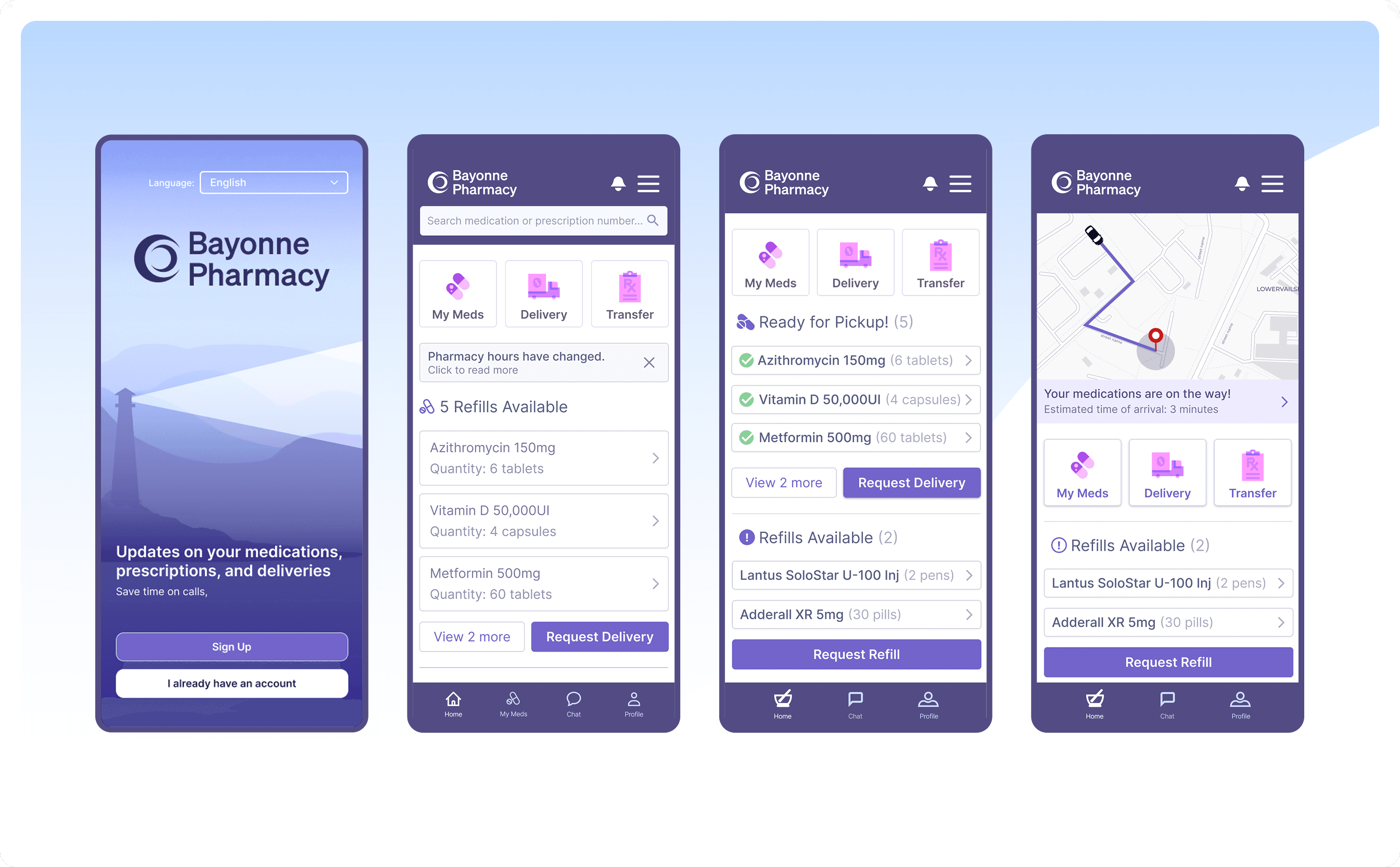
Modernizing the Patient Story
//Teaching a old dog new tricks

We focused on creating an intuitive, visually engaging experience that made accessing critical patient data effortless.
Iterations led to using a similar tactic as Facebook, Instagram, and Snapchat of adding a ring over the patient profile pic. Ultimately replacing the old rarely discovered "press and hold" details hover.
With a simple tap, they could pull up critical details, precautions, recent notes, common actions, and trends. A huge time saver for a workflows that would generally take 5-7 more clicks to get to the patient activity they needed to see.
Feature tracking found this to be one of our most used features with millions of uses annually, despite users not anticipating it. Stepping ahead of the curve while using patterns they were already familiar with produced a design I might be most proud of from my time at Epic.

Data Analysis and Visualization

Designing the Safety Check Compliance Dashboard was all about clarity and speed. We started by mapping out user workflows to understand how compliance data can best be utilized to improve patient care. Using insights from our user interviews, we focused on a dashboard layout that provided real-time alerts, easy-to-read charts, and actionable insights without overwhelming users. We iterated through multiple wireframe versions, continuously testing with staff to ensure it aligned with their mental models and daily tasks.


Outcomes at facilities varied based on the insights we were able to give. With each graph or data visualization specifically crafted to answer essential questions therapists and floor managers have.
Therapists are now able to find out
Where and when a patients are struggling to maintain elevated moods
Track issues that have happened on the floor since their last meeting
Meanwhile floor managers could now
Understand when and why staffing shortages happen
Ensure that patients are being accurately accounted for
Implement strategies to boost safety check compliance with data backing the results of their actions
For one example, the Ohio Department of Mental Health and Addiction services reported a 99.5% compliance rate for almost 102,000 checks per day through Rover.
We used a mix of automated system logs, manual audits, and user feedback surveys to validate the design solutions we came up with. The dashboard recorded compliance checks in real time with timestamps and geolocation data. Regular audits validated the system's reports, while surveys collected qualitative feedback to gauge overall satisfaction.
Peaks of Joy
Understanding that healthcare should go beyond software in matters of empathy and compassion, as well as understanding the results of past studied where stylized MRI experiences reduced the need for sedation for younger patients. I explored a fun way to add comfort to the idea of always wearing a wristband and proposed bands that allow people the choice between fun designs and brought the smallest peak of joy to the team.

Reflections
Balancing efficiency and usability is always tricky. We nailed the core functionality and met our users needs each time, but I'll always wish I could've added even more peaks of joy to the workflow.
At the risk of sounding cheesy, I've really enjoy working at Epic. I was given the opportunity to travel around hospitals around the country and world, and at every one of those places I have seen my software being used to help people in a sick and vulnerable state. To me, there's nothing quite like that.
Three years braving the Wisconsin winters, have given me plenty to chat about. Thanks for reading.