Extended Care Professionals
Extended Care Professionals
Lead Product Architect

2025-26
Project Date
%
Client Growth
+
Communities
Opportunity
//A product story focused on systems thinking
As a product architect, I was tasked with re-mapping and re-envisioning the structure of ECP’s clinical platform, creating stronger connections between clinical workflows, billing systems, and the CRM ecosystem. I led NextGen design support across care charting and medication pass experiences while producing research insights and platform designs that directly influenced product roadmap priorities.
Starting Context
//Modals on modals on modals on modals on modals on…

ECP's clinical product excelled at what it did for the past 20 years.
It provided all the tools, albeit some in the wrong places. It worked like an OS where residents have their own files, quite literally. Alongside this, competition in the industry was ramping up with modern interfaces creating revenue leakage.
Design Outcomes
//13 clicks -> 1


UX decisions were directly tied to client retention and growth, going beyond surface level interface improvements to focus on operational clarity for our users.
The clarity and forward vision established through this work enabled sales teams to communicate a compelling platform direction, contributing to a near doubling of facility adoption and supporting the successful onboarding of the largest assisted living organization in the country. Strengthening ECP’s market position and share.


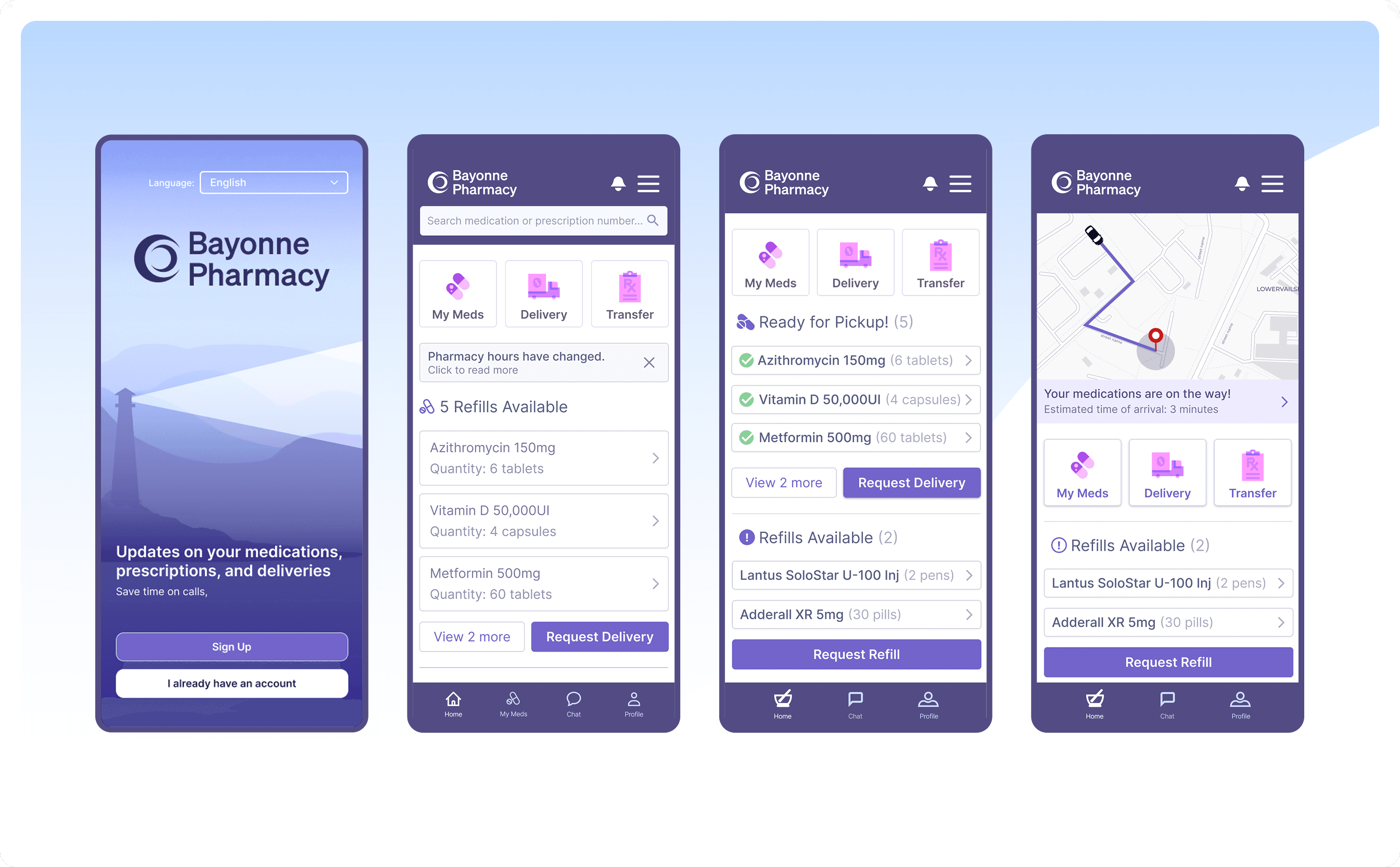
One of the clearest insights from user interviews was how often caregivers were working away from a workstation. Many documentation tasks were happening in hallways, resident rooms, or while moving between units. The existing mobile experience was limited and forced staff to rely on bulky laptops or return to nursing stations to complete charting.
This created an opportunity to design a true mobile-first experience for core caregiving tasks. The new interface focused on three high-frequency actions: reviewing notifications, charting cares, and completing medication passes. Each flow was streamlined to reduce steps and surface the most relevant information quickly, allowing caregivers to document work in real time rather than hours later.
Pain Points and Insights
//Moving past 2004 takes some tough work
Discussions with veteran team members at ECP allowed me to quickly get up to speed on the issues the clinical product was facing and where to begin with getting ahead on the sitemap architecture. Through leveraging the wealth of knowledge that came from our customer experience, implementation, and sales teams, I was able to quickly piece together a list of issues to be tackled with the redesign.
Overuse of Modal Popups
Obscuring content and slowing down documentation processes.
Navigation Issues
Poor transitions between documentation tools and informational pages, disjointing the user experience where broader patient context matters.
Poor transitions between documentation tools and informational pages,
Unlinked Workflows
Care charting is broken apart into three separate workflows, leading to confusion among new users.
System Status Visibility
Makes it difficult for users to understand what actions have been completed or are in progress.
I wasn't going to take it just from the team though, as much as I would love to take their word for everything. We went ahead and validated those points through discussions with multiple of our clients and end users through interviews and surveys. What we found out validated prior concerns, but also added more issues for us to focus on with the redesign.
Increasing Reliance on Mobile Flows
Users are more reliant on mobile and tablet flows, which were considerably less developed than the current browser client.
High Level Overview of Patients Needs Clarity
Users expressed that they struggle to get a high level overview of a particular resident at a glance when viewing a resident's portfolio
Poor transitions between documentation tools and informational pages,
Filters and Navigation Need Overhaul
Users struggled with the variety of filter options provided, noting a lack of clarity when building out a view
New Navigation Flows
//Entered the labyrinth, sadly did not bump into the goblin king
Navigation was one of the largest sources of friction in the clinical product. Over time, features had been added wherever space allowed, resulting in a navigation system that reflected the history of the product rather than the mental model of the people using it. Users frequently had to jump between unrelated sections of the platform to complete a single task, breaking context and slowing down documentation.

When depth is no issue, clarity typically is.
Reflections
//On to the next journey
ECP’s clinical platform had grown into a collection of powerful tools that did their jobs well but rarely talked to each other in a clear way. The real opportunity was stepping back and rethinking the structure of the platform itself. Instead of focusing on isolated UI improvements, the work centered on how clinical documentation, billing, and CRM systems should connect as one ecosystem.
Shifting the effort toward systems thinking helped create clarity across the product. Navigation, workflow relationships, and information structure started working together instead of competing with each other. That clarity also gave leadership, engineering, and sales a shared direction for where the platform was heading.
In enterprise healthcare software the people using these systems are busy professionals responsible for real patients. Every extra click and every confusing transition adds friction to their day. Good design removes that friction by fixing the structure behind the interface, untangling twenty years of product decisions.
Extended Care Professionals
UX Architect
Role
2025-26
Project Date
%
Client Growth
+
Communities
Opportunity
//A product story focused on systems thinking
As a product architect, I was tasked with re-mapping and re-envisioning the structure of ECP’s clinical platform, creating stronger connections between clinical workflows, billing systems, and the CRM ecosystem. I led NextGen design support across care charting and medication pass experiences while producing research insights and platform designs that directly influenced product roadmap priorities.
Starting Context
//Modals on modals on modals on modals on modals on…
ECP's clinical product excelled at what it did for the past 20 years.
It provided all the tools, albeit some in the wrong places. It worked like an OS where residents have their own files, quite literally. Alongside this, competition in the industry was ramping up with modern interfaces creating revenue leakage.
Design Outcomes
//13 clicks -> 1

UX decisions were directly tied to client retention and growth, going beyond surface level interface improvements to focus on operational clarity for our users.
The clarity and forward vision established through this work enabled sales teams to communicate a compelling platform direction, contributing to a near doubling of facility adoption and supporting the successful onboarding of the largest assisted living organization in the country. Strengthening ECP’s market position and share.
One of the clearest insights from user interviews was how often caregivers were working away from a workstation. Many documentation tasks were happening in hallways, resident rooms, or while moving between units. The existing mobile experience was limited and forced staff to rely on bulky laptops or return to nursing stations to complete charting.
This created an opportunity to design a true mobile-first experience for core caregiving tasks. The new interface focused on three high-frequency actions: reviewing notifications, charting cares, and completing medication passes. Each flow was streamlined to reduce steps and surface the most relevant information quickly, allowing caregivers to document work in real time rather than hours later.
Pain Points and Insights
//Moving past 2004 takes some tough work
Discussions with veteran team members at ECP allowed me to quickly get up to speed on the issues the clinical product was facing and where to begin with getting ahead on the sitemap architecture. Through leveraging the wealth of knowledge that came from our customer experience, implementation, and sales teams, I was able to quickly piece together a list of issues to be tackled with the redesign.
Overuse of Modal Popups
Obscuring content and slowing down documentation processes.
Navigation Issues
Poor transitions between documentation tools and informational pages,
Unlinked Workflows
Care charting is broken apart into three separate workflows, leading to confusion among new users.
System Status Visibility
Makes it difficult for users to understand what actions have been completed or are in progress.
I wasn't going to take it just from the team though, as much as I would love to take their word for everything. We went ahead and validated those points through discussions with multiple of our clients and end users through interviews and surveys. What we found out validated prior concerns, but also added more issues for us to focus on with the redesign.
Increasing Reliance on Mobile Flows
Users are more reliant on mobile and tablet flows, which were considerably less developed than the current browser client.
High Level Overview of Patients Needs Clarity
Poor transitions between documentation tools and informational pages,
Filters and Navigation Need Overhaul
Users struggled with the variety of filter options provided, noting a lack of clarity when building out a view
New Navigation Flows
//Entered the labyrinth, sadly did not bump into the goblin king
Navigation was one of the largest sources of friction in the clinical product. Over time, features had been added wherever space allowed, resulting in a navigation system that reflected the history of the product rather than the mental model of the people using it. Users frequently had to jump between unrelated sections of the platform to complete a single task, breaking context and slowing down documentation.
When depth is no issue, clarity typically is.
Reflections
//On to the next journey
ECP’s clinical platform had grown into a collection of powerful tools that did their jobs well but rarely talked to each other in a clear way. The real opportunity was stepping back and rethinking the structure of the platform itself.
Shifting the effort toward systems thinking helped create clarity across the product. Navigation, workflow relationships, and information structure started working together instead of competing with each other. That clarity also gave leadership, engineering, and sales a shared direction for where the platform was heading.
In enterprise healthcare software the people using these systems are busy professionals responsible for real patients. Every extra click and every confusing transition adds friction to their day. Good design removes that friction by fixing the structure behind the interface, untangling twenty years of product decisions.